
NASA Redesign
My goal for this assignment was to redesigned the current NASA iOS app. This project included designing and developing a new feature which I felt necessary. Major flaws existed in the app's information architecture and user interface. Tackling this data monster was no easy task and I was determined developing a simple flow guide would facilitate further project expansion should I decide to extend work beyond the assignment. I focused on information simplification in the design so the app easily flows in an intuitive manner.


THE PROBLEM
The current state of the application is serval years outdated.
One user described it as "juvenile"
Looks as if was laid out by engineers that lack a background in UX Design
There is no flow to follow. Information is not organized well, there is no main menu, tons of complex text, and many unnecessary and useless buttons.
Not useful to anybody but those know a lot about space already; not welcoming to new users.
THE SOLUTION
Give the UI a face lift.
Adjust the information architecture to maximize intuitiveness.
Change the way the data & information on a topic is displayed to the user.
The data can be read by the user off of the page
Users can ask the app to explain things and answer their questions and save answer topics for future access


AI PERSONAL TUTOR
Humans are inevitably curious and always eager to learn something new. Using the NASA app to view resources to further expand knowledge of the solar system the user is faced with a text heavy, impersonal, & complex UI.
To combat the complex, text heavy information pages, a personal tutor/virtual assistant would be built and integrated in the redesigned application. The user can interact with virtual assistant to ask questions and learn from. Learnings can be personalized based on what topics of user interested in and chucked into snippets that maximize learning.
INTERACTIONS & ANIMATIONS


REDESIGNED USER INTERFACE
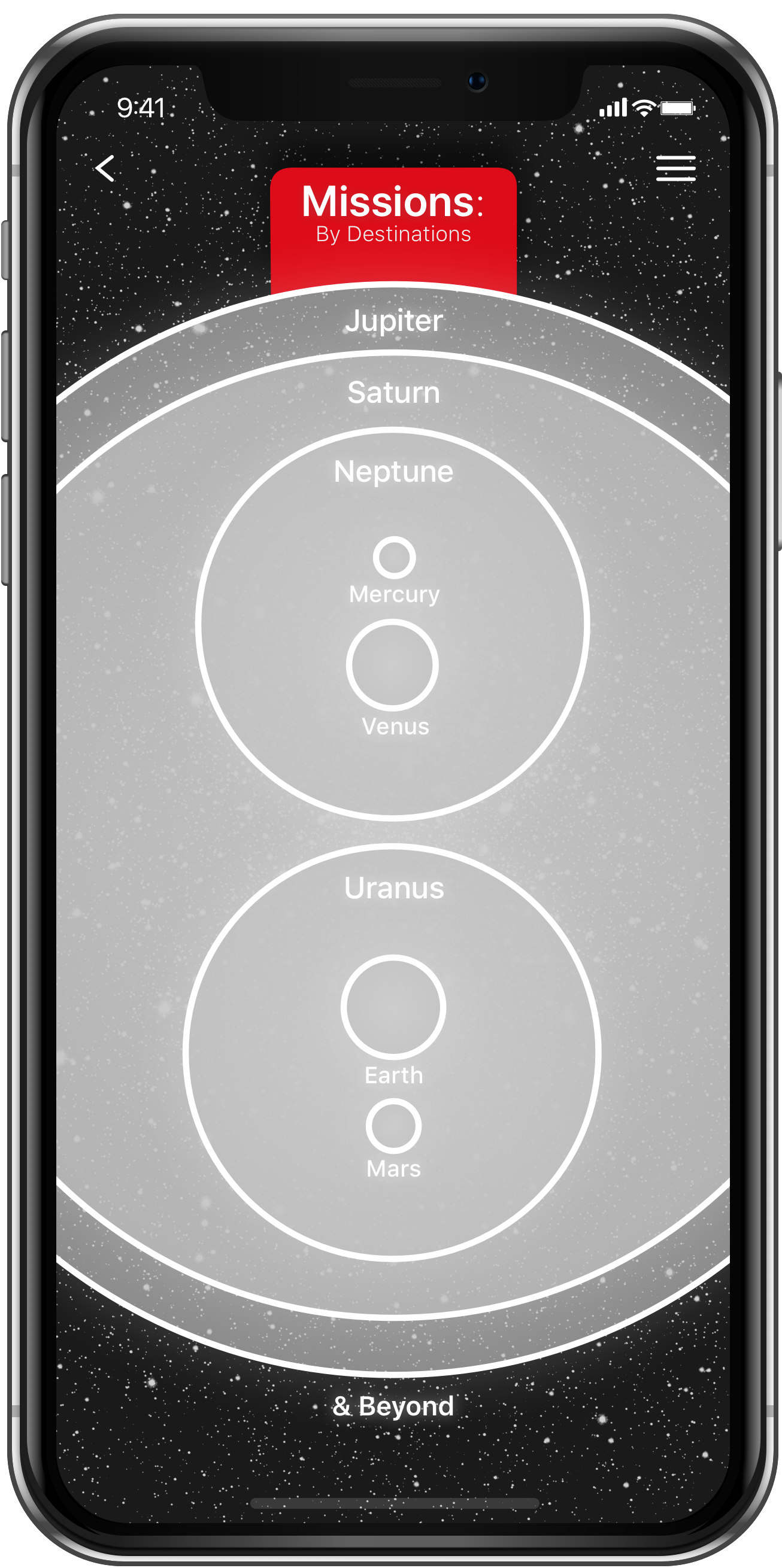
Using visualizations and images from interplanetary missions was an important piece of redesigning the mission exploration within the app. Each planet's page displays four top facts about it, along with all the missions by NASA that have passed by the planet.
Once a mission is selected, the page displays further information about what the mission accomplished, learned, and pictures taken by the craft. This then connects to the Personal Tutor to inform the user of additional facts or asks if they have any questions relating to the mission.


“A real let down for me is the low-quality icons. It’s a huge turnoff.”
CURRENT NASA APP UI & USER TESTING
I conducted an interview and application walkthrough with a former director of ecommerce revealed that she shared a similar distaste for the organizational structure and aesthetics of the UI design. She was surprised with how 'amateur' the app felt for a such a important administration. One of the most frustrating things for her was the lack of menu navigation, which ultimately resulted in disappointment in the app.

